Gnome Section Blocks
Section Block are Gnome components available via the WP edit interface as (Gnome [section-name]) that expand to fill the entire width of the page. Place sections outside of any column (such as the Gutenberg’s column block) or directly into the WP editor for proper display as they have styling that already accounts for width and height and they only need content.
Gnome Hero
The Hero components is a core component and displays at the top of any page to brand, engage and to assure a visitor of being in the correct place. A hero has multiple optional customizable options such as:
- Brand: Displays a Sitation logo or any associated brand above the title when needed such as displaying the plezio logo on the plezio page
- Highlight: A an action, benefit or word that should be highlighted
- Title: A continuation of the Highlight
- Subtitle: A description that support the title above
- Primary and secondary actions
- Type: A list of styled variants such as text-only(simple) or having image, animation, etc.
- Image: The actual image that corresponds to the selected type like: .jgp, .lottie, etc
- Color: The corresponding brand colors that should be selected int he context of where the Hero is being used for example:
- Primary: for pages that are directly associated or talk about Sitation such as services, partners, etc.
- Secondary:
- for pages that are not directly associated like a blog post
- for apps including all our Plezio Suite
- App Name: for pages for each specific product
- Alignment: Only available for variant: Type:simple
Samples
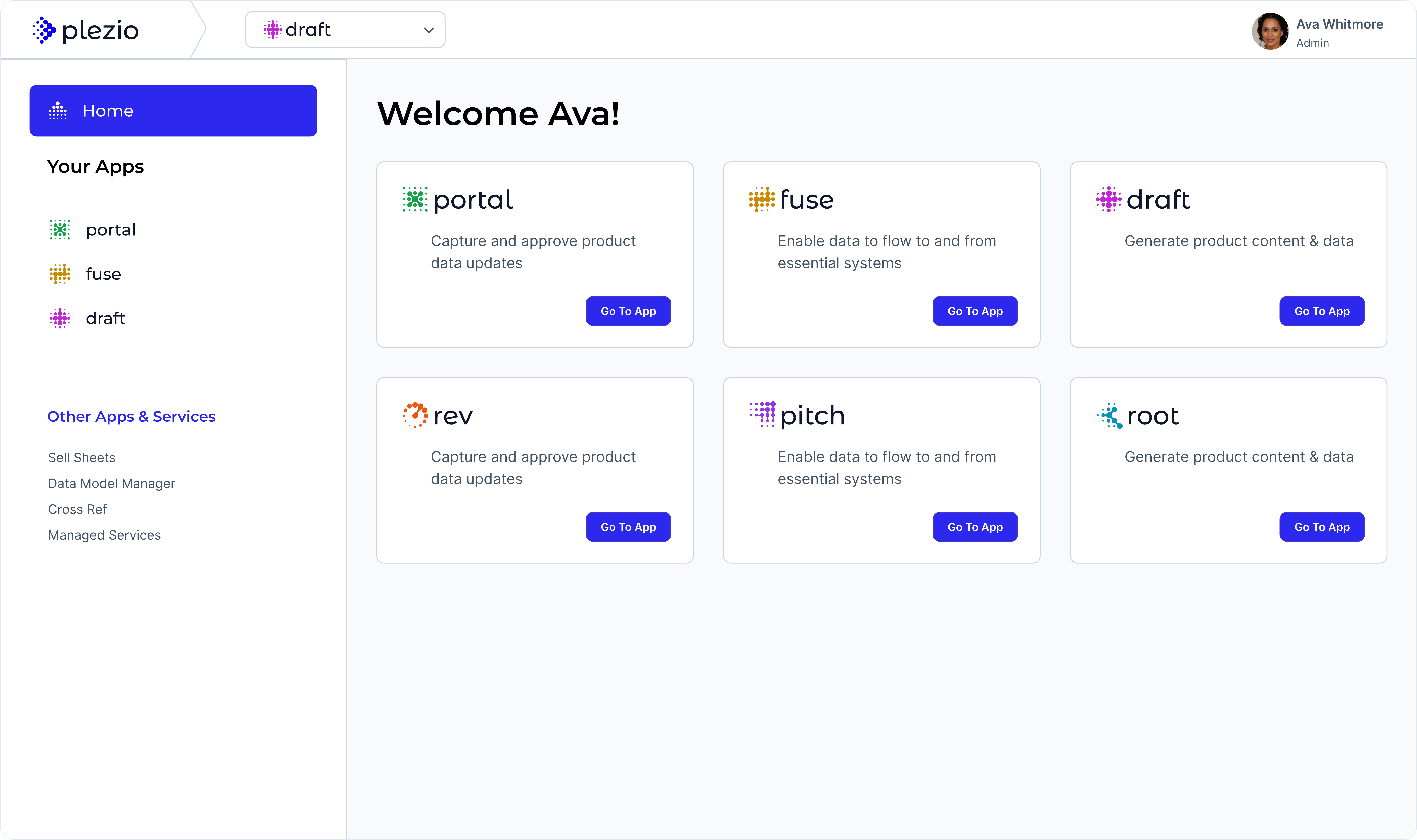
Let’s Win On the Digital Shelf
A brief descriptions to complement the title
Innovative Solutions for Digital Merchandising
Sitation’s Software Suite: Plezio
Gnome CTA
The CTA (Call to Action) component is a core component and displays more often at the bottom of any page but it could also be placed in any location that presents and opportunity for the visitor to convert. A CTA has multiple optional customizable options:
- Title: An encouraging statement intended to persuade a visitor to click the CTA button
- Description
- CTA Text: A friendly action to be performed. Do not use generic words like submit or go.
- Color: Use a primary variant when using the CTA at the bottom of the page or a secondary variant when embed in content.
Samples:
Ready to Strengthen Your Team?
Contact us today to learn more about how our ongoing professional services can help your business thrive.
Ready to Strengthen Your Team?
Contact us today to learn more about how our ongoing professional services can help your business thrive.
Gnome FAQs
A collapsible component to reveal questions and answers. Options:
- Title: A high level question a visitor may be wondering about
- Faqs: Enter as many questions and answers as needed
Sample:
How does Sitation use Artificial Intelligence when generating content?
Gnome Feature
The feature component summarizes and highlights the main features or benefits of a service or product. Options are:
- Title: about a service, product
- Description: Brief explanation
- Feature
- Icon: Select and copy an icon name from library of Gnome Icons
- Name: Name of the Feature
- Description” Explanation about the feature. (Supports paragraph only)
Samples
What Can Plezio Draft Do for Your Business?
Plezio Draft AI-powered features are designed to tackle the most challenging aspects of product content management.

Gnome Testimonial
Type: List
- Title
- Testimonial
- Body: The actual quote
- Author Name
- Author Title
Sample
Testimonials
What our Customers Say
““The Sitation team has been great! I couldn’t be happier! Everyone has created value and we are confident Sitation will deliver!””
“You took a 2 and 1/2 year mess and cleaned it up in 5 months!”
“I wanted to personally thank you all for your help and guidance over the last 1.5 years. We are truly a better organization for it.”
Gnome Component Blocks
Component Blocks are single components that require a parent layout such as using columns in the word press interface. They expand to cover the area they are in and represent a single entity like one quote or one product, etc.
Gnome Testimonial
Type: Single
The single testimonial component must be used inside a column block. You’ll recognize it is inside a block if it is inside a red rectangle when editing the page in admin mode.
- logo: Client logo
- Body: actual quote
- Author Name
- Author Title

““The Sitation team has been great! I couldn’t be happier! Everyone has created value and we are confident Sitation will deliver!””
Gnome Wysiwyg
The wysiwyg component is a flexible component that allows for custom formatting. Use it when there is no other gnome section or component that allows to communicate the intended content. Options are:
- Media Type: Displays the UI for adding animations, image files or an icon name from the gnome icons library.
- File: The actual file or icon name
- Color: Contains the 3 main Sitation colors and can be used to increase contrast to content, draw attention or simply improve the aesthetics.
- Body: The actual wysiwyg interface for any content expect images.
Title
- Positive Point 1
- Positive Point 2
- Positive Point 3
- Positive Point 4

Title
- Positive Point 1
- Positive Point 2
- Positive Point 3
- Positive Point 4
Title
- Positive Point 1
- Positive Point 2
- Positive Point 3
- Positive Point 4
Title
WYSIWYG Content
Gnome Card
A simple card component with defined fields and actionable links. Options are:
- Image: animation .lootie, jpgs, pngs.
- Title
- Description
- Primary Action: A url to another page
Plezio Draft
Generate and analyze product information at scale using AI.
Digital Merchandising
Enhancing product presentation to boost customer engagement and conversion rates.
Gnome Brand
Renders all Sitation logos in standard sizes. Options are:
- Name: The brand name such as: sitation, plezio, etc.
- Size: xs to full (expands to fill it’s container)
- Color: Use the primary-reversed color when on a blue or black background otherwise use the primary or corresponding app name
Gnome Animation
Embeds an animation from a .lottie file. Go to https://lottiefiles.com/ or request access to search for new animations. Follow our Illustration guidlines for selecting animation that best fit our brand
Helpers
Image Fillers:
Complement layout by filling up space and maintaining balance on the page and overall design and also adding elements of the main hero branded image to help highlight a section if nedeed. They are displayed in desktop but hidden in mobile by default.
1/4 Long
1/4
Short
1/3 Long

1/3 Short
